-02.png)
|

|
|

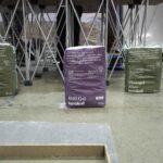
REcircula ofrece diferentes soluciones para la gestión y reutilización de residuos de obra, embalajes y envases, con acompañamiento experto y certificaciones.
El sector de la construcción consume alrededor del 50% de la extracción de materiales en el mundo. Se prevé que en 2060 la necesidad de materiales se doble, y un tercio de este aumento será atribuible a la construcción de edificios. En este escenario reducir la extracción de recursos naturales se convierte en una tarea clave.
Orientado hacia este objetivo, Saint-Gobain, líder mundial en construcción ligera y sostenible, anuncia el lanzamiento de REcircula, su nueva marca paraguas que integra y amplía los servicios de reciclaje y valorización de residuos del Grupo. De esta forma, contribuye a impulsar la economía circular en el sector de la edificación al mismo tiempo que acompaña a sus clientes en el cumplimiento de las nuevas exigencias normativas.
Un compromiso real con la sostenibilidad
REcircula reúne bajo una misma marca los servicios ya operativos de Saint-Gobain en España: Placo® RECICLA (reciclaje de placa de yeso laminado), Climalit® RECICLA (reciclaje de vidrio y cerramientos), y servicio de reciclaje CLIMAVER® (reciclaje de paneles CLIMAVER® para conductos de climatización). Estos servicios ofrecen a clientes, promotores, constructores, ingenieros y arquitectos una solución integral para cumplir con los requisitos legales de valorización y reciclaje de residuos de construcción y demolición.
«Con REcircula damos un paso más en nuestro compromiso: facilitar a nuestros clientes la gestión y valorización del 70% de sus residuos de obra, acompañándolos en todo el proceso, desde la segregación y recogida hasta la reintegración de estos materiales reciclados en nuevas soluciones constructivas,»
destaca Alberto García-Blanco, responsable de Sostenibilidad de Saint-Gobain España.
Soluciones adaptadas a la nueva normativa
En España, la tasa de recuperación de residuos de construcción y demolición está fijada en el 70%, y desde el 1 de enero de 2024 es obligatoria la demolición selectiva y separación de determinadas fracciones como el vidrio y el yeso, entre otros. Además, desde el 1 de enero de 2025, la nueva legislación española en materia de residuos y envases industriales exige a todos los agentes del sector asumir la Responsabilidad Ampliada del Productor (RAP) y gestionar correctamente sus residuos de embalajes y envases. Saint-Gobain con REcircula responde a estas obligaciones legales, facilitando a sus clientes el cumplimiento normativo y la puesta en marcha de servicios adaptados a cada tipo de material y necesidad.
Todos los servicios de REcircula ya están activos y disponibles, y su puesta en marcha depende de la solicitud del cliente o la obra, a través de los canales indicados para cada servicio.
El equipo de Saint-Gobain guía y acompaña a cada cliente en la activación y seguimiento de los servicios, asegurando la trazabilidad y estudiando la mejor manera de implementarlos en cada obra.
Una hoja de ruta para 2050
Saint-Gobain ha asumido el objetivo para 2050 de no emitir más carbono del que absorbe. Para ello, ha desarrollado una ruta clara, con objetivos estructurados. Entre ellos, se encuentran los relativos a la circularidad de las materias primas que se utilizan en el sector de la construcción: emplear envases 100% reciclables y con contenido reciclado, y reducir el empleo de materias primas vírgenes, entre otros.
Es por ello, que desde 2017 ha ido lanzando al mercado nuevos servicios para la recuperación de materiales y valorización de residuos, como el servicio de reciclaje Placo® RECICLA, Climalit® RECICLA, y por último el servicio de reciclaje de CLIMAVER® dentro de Isover RECICLA. Ahora, todos estos servicios se encuentran bajo la marca REcircula.
Sobre Saint-Gobain
Líder mundial en construcción ligera y sostenible, Saint-Gobain diseña, fabrica y distribuye materiales y servicios para los mercados de la construcción y la industria.
Sus soluciones completas orientadas a la renovación de edificios, la construcción ligera y la descarbonización de la industria, se desarrollan a través de un proceso continuo de innovación, proporcionando sostenibilidad y altas prestaciones. El Grupo, que celebra este año su 360 aniversario en el mundo y 120 años de presencia en España, está más comprometido que nunca con su propósito de “MAKING THE WORLD A BETTER HOME”.
Compañía Saint-Gobain a grandes cifras:

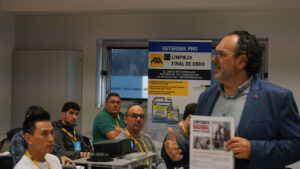
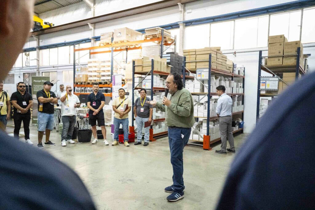
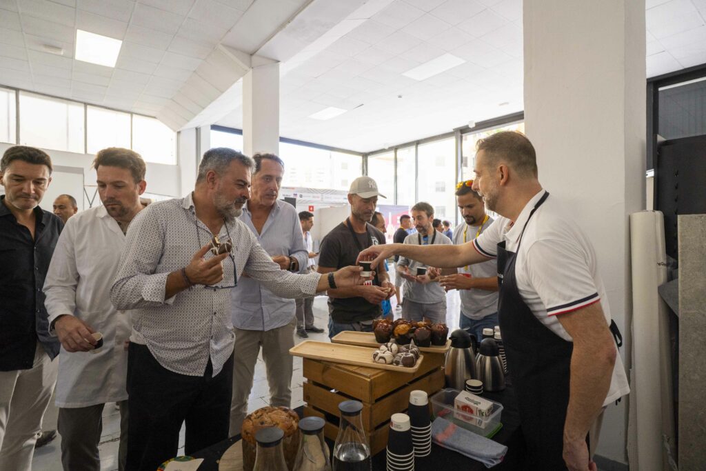
El pasado 5 de noviembre, las instalaciones del Cosentino Center en San Sebastián acogieron una nueva edición del Networking Activo, un espacio de encuentro para profesionales del sector de la construcción, la reforma y la arquitectura. Fustecma participó mostrando su experiencia en diseño y ejecución de proyectos contract para tiendas, showrooms y espacios comerciales.
Durante la jornada, la firma destacó la importancia de crear entornos con identidad propia que reflejen los valores de cada marca. Los asistentes pudieron conocer de cerca soluciones innovadoras en interiorismo comercial, que abarcan desde el diseño conceptual hasta la fabricación y montaje integral, optimizando tiempos y recursos.
El Networking permitió a Fustecma una oportunidad privilegiada para interactuar de manera directa con arquitectos, diseñadores y otros profesionales del sector. Durante estos encuentros, la firma pudo resolver dudas, presentar soluciones personalizadas, intercambiar experiencias y establecer nuevas sinergias que enriquecen su trabajo diario.
Estas conversaciones cara a cara no solo facilitaron un mayor conocimiento de las necesidades reales del mercado, sino que también fortalecieron relaciones profesionales clave para futuros proyectos.
La participación de la marca en este entorno especializado reafirmó, además, su posición como un referente en proyectos contract a medida, donde cada intervención combina de forma equilibrada funcionalidad, diseño estético y capacidad de adaptación a los requisitos específicos de cada cliente. Fustecma demostró así su compromiso con la innovación y la excelencia en cada una de sus propuestas.

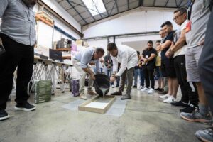
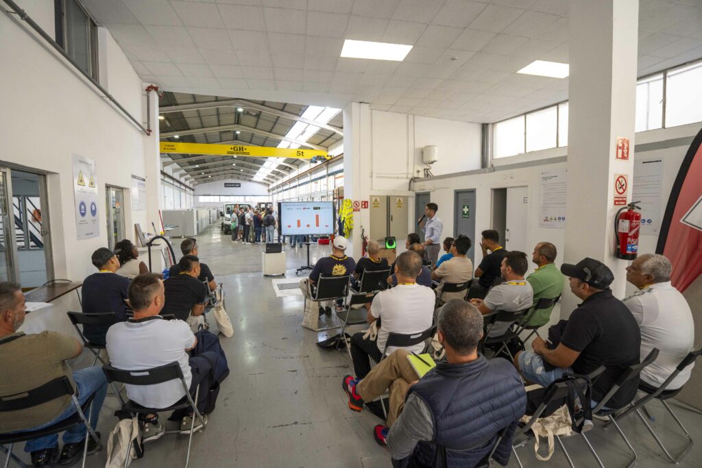
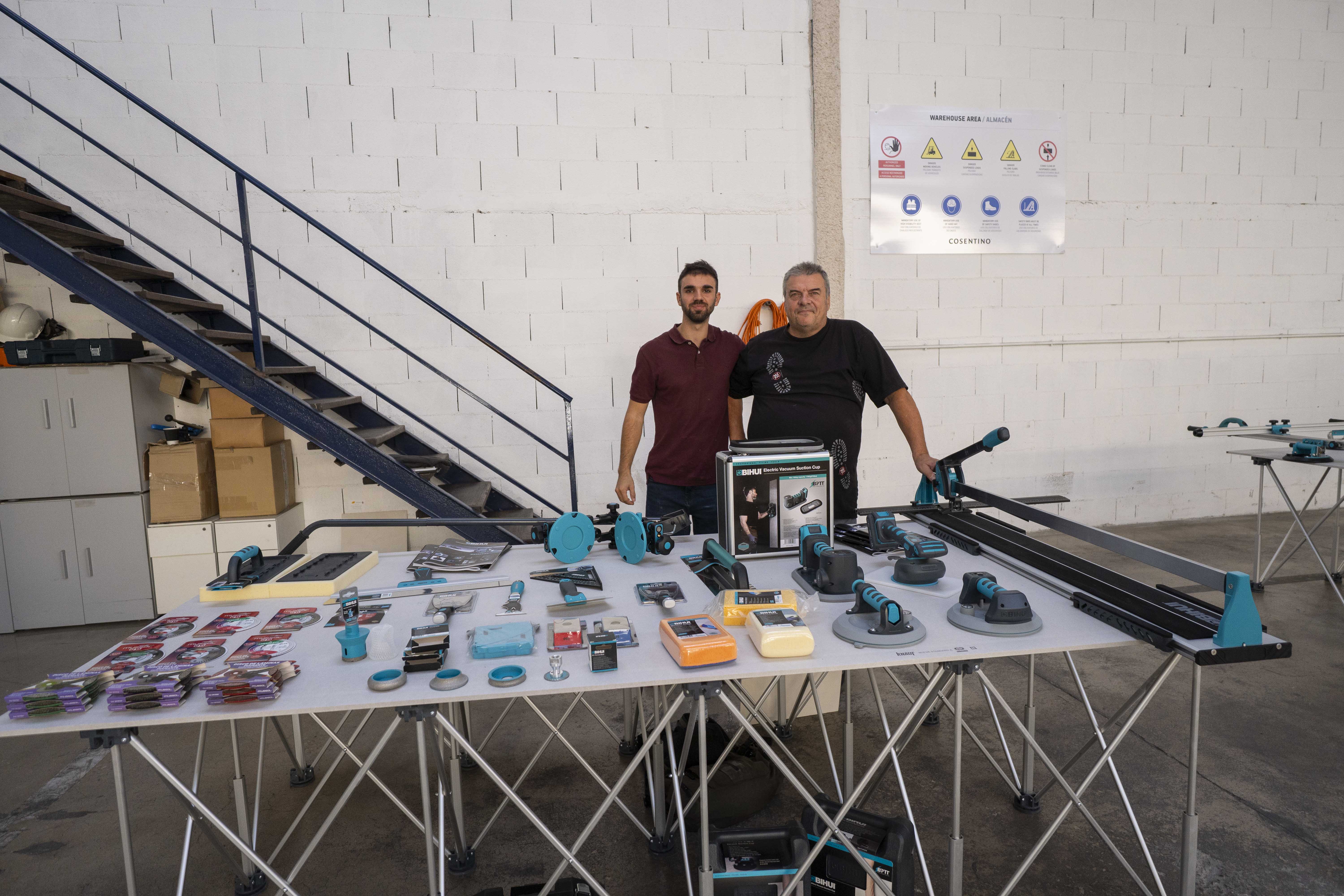
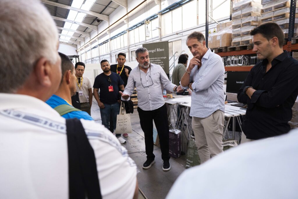
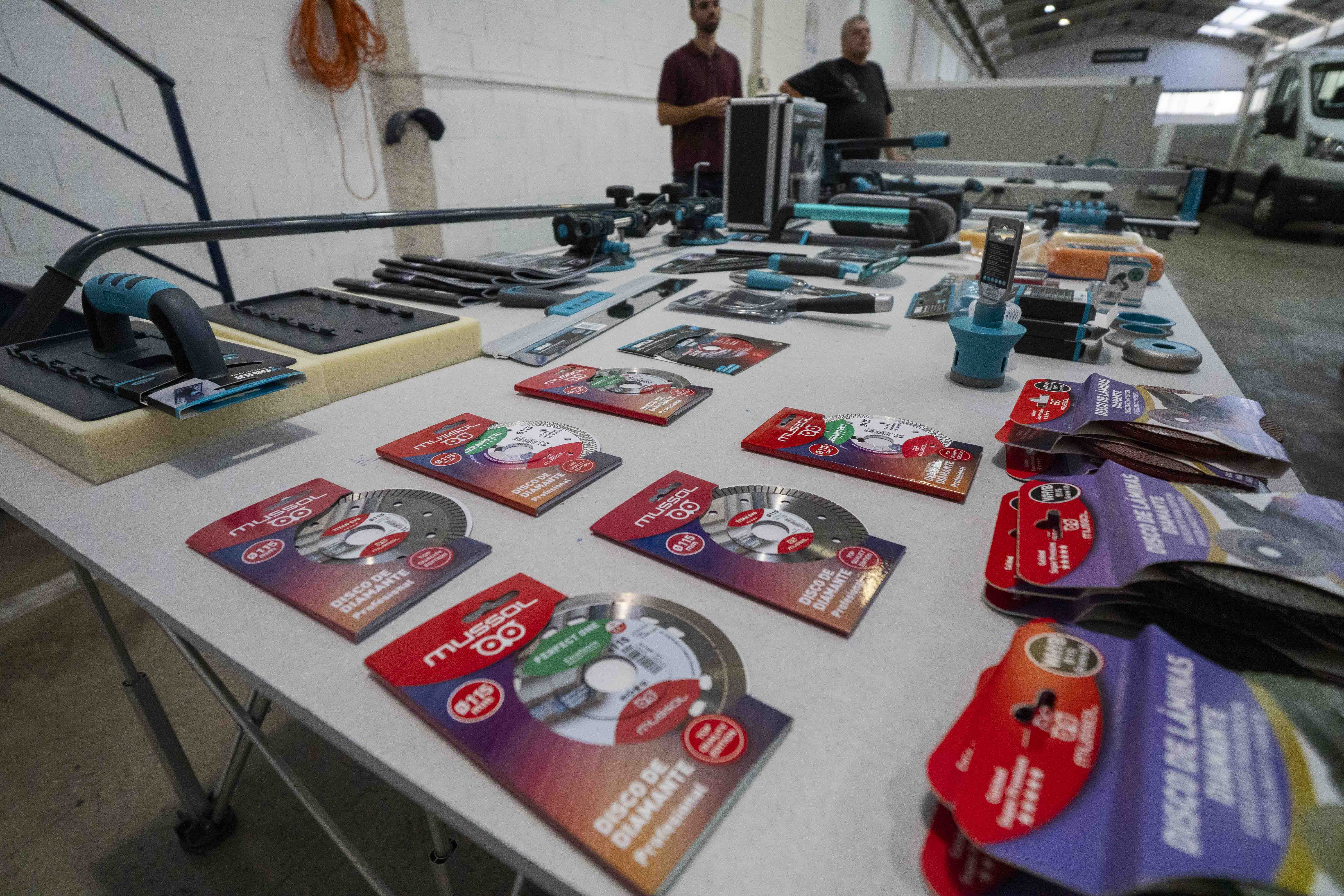
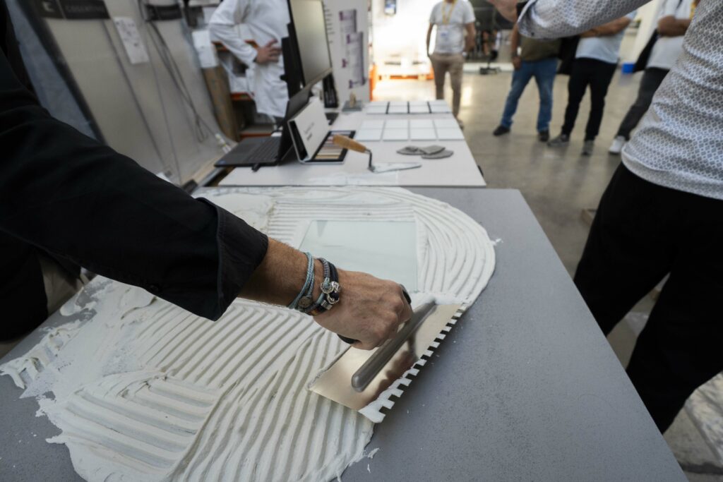
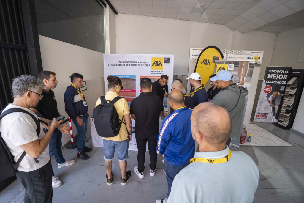
Cosentino Center San Sebastián fue el escenario de una jornada formativa de alto nivel con la celebración de la Masterclass XXL – Formación técnica en gran formato, un evento que reunió a profesionales del sector de la instalación, la reforma y la construcción interesados en perfeccionar sus conocimientos sobre materiales cerámicos de gran formato y superficies ultracompactas.
Durante la mañana, los asistentes —entre ellos instaladores, técnicos de obra, jefes de ejecución, reformistas y distribuidores— disfrutaron de una completa sesión teórico-práctica en la que se abordaron los procedimientos de instalación, manipulación y colocación segura de piezas XXL, así como el uso de herramientas y adhesivos específicos para garantizar resultados óptimos en proyectos de gran exigencia técnica.
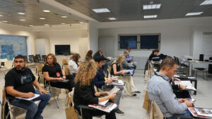
La jornada destacó por su enfoque eminentemente práctico, con demostraciones en directo que permitieron a los profesionales interactuar con los expertos, resolver dudas y experimentar de primera mano las soluciones más avanzadas del mercado. Además, la zona de stands técnicos ofreció asesoramiento personalizado por parte de las empresas colaboradoras, que mostraron las últimas innovaciones en sistemas de instalación, herramientas de precisión y materiales de nueva generación.
El ambiente de la Masterclass fue participativo y dinámico, favoreciendo el intercambio de experiencias entre profesionales del sector y consolidando este formato como una cita de referencia para quienes buscan formación técnica de calidad.
Los asistentes coincidieron en destacar la excelente organización y el alto valor práctico de la jornada, que se consolida como una oportunidad inmejorable para actualizar conocimientos y reforzar la red de contactos en el ámbito de la colocación cerámica profesional.


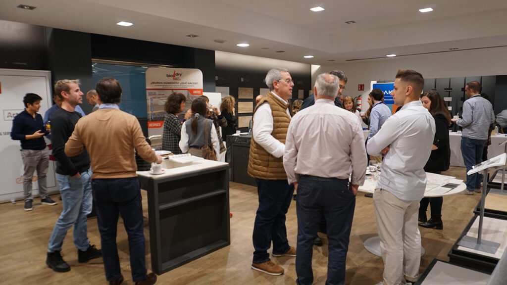
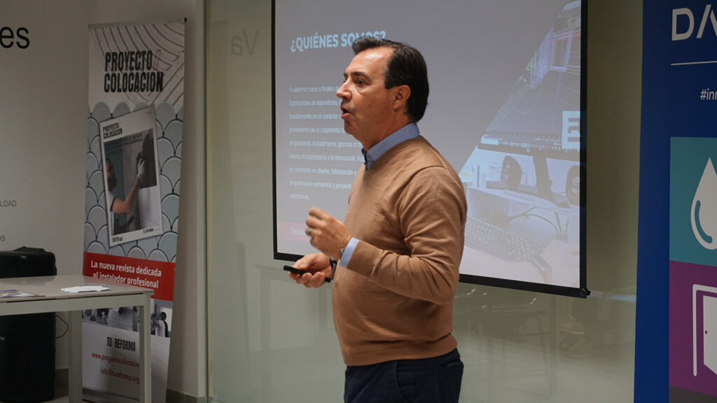
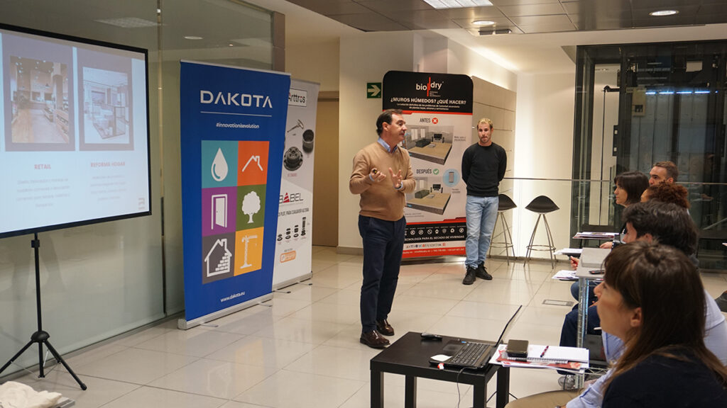
Las instalaciones de Cosentino Center en el Polígono Industrial Lanbarren – Arragua, Gipuzkoa se convirtieron el martes 5 de noviembre del 2025 en el epicentro del diseño, la arquitectura y la construcción sostenible, con la celebración del esperado Networking Activo de San Sebastián, una cita organizada por TU/REFORMA en colaboración con el Colegio Oficial de Diseñadores de Interiores / Decoradores de Gipuzkoa.
El evento, que reunió a un nutrido grupo de profesionales del sector, se destacó por su ambiente participativo, su nivel de ponencias y el alto interés suscitado entre arquitectos, diseñadores, interioristas y empresas vinculadas al sector de la construcción.
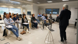
La jornada comenzó con una intervención magistral del reconocido arquitecto Jaime Sanahuja, Doctor en Arquitectura y profesor de la Universidad Politécnica de Valencia, quien ofreció una inspiradora conferencia titulada “Arquitectura desde el Mediterráneo”. En ella, Sanahuja compartió su particular visión sobre la relación entre el entorno, la luz y los materiales, destacando la importancia de un enfoque sostenible y sensible al paisaje.
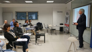
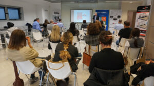
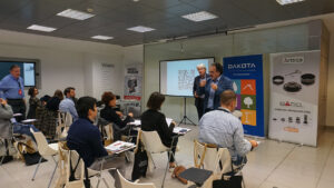
Además de la ponencia central, el Networking Activo ofreció sesiones exprés formativas en las que destacadas empresas del sector presentaron sus últimas innovaciones y soluciones técnicas:
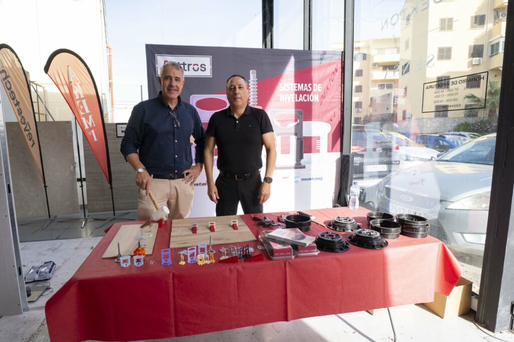
Arttros mostró su sistema de nivelación Babel, que permite una regulación precisa y eficiente.
Akemi sorprendió con su maletín de reparación de baldosas, una herramienta que facilita reparaciones casi invisibles.
Bio Dry presentó su sistema natural para eliminar la humedad ascendente, basado en principios físicos no invasivos.
Dakota compartió su experiencia de más de 40 años en la fabricación de soluciones innovadoras para la construcción.
Revestech expuso sus sistemas de impermeabilización sostenibles y seguros.
Fustecma abordó la importancia de los proyectos llave en mano, con ejemplos destacados en retail y showrooms como Roberto Verino o Grespania Cerámica.
La combinación de ponencias, demostraciones técnicas y espacios para el intercambio de ideas convirtió la jornada en una experiencia enriquecedora y dinámica, donde los asistentes pudieron ampliar contactos profesionales y descubrir nuevas oportunidades de colaboración.
El evento cerró con un ambiente de satisfacción general, destacando la oportunidad de compartir conocimiento y fortalecer la comunidad profesional del norte peninsular.

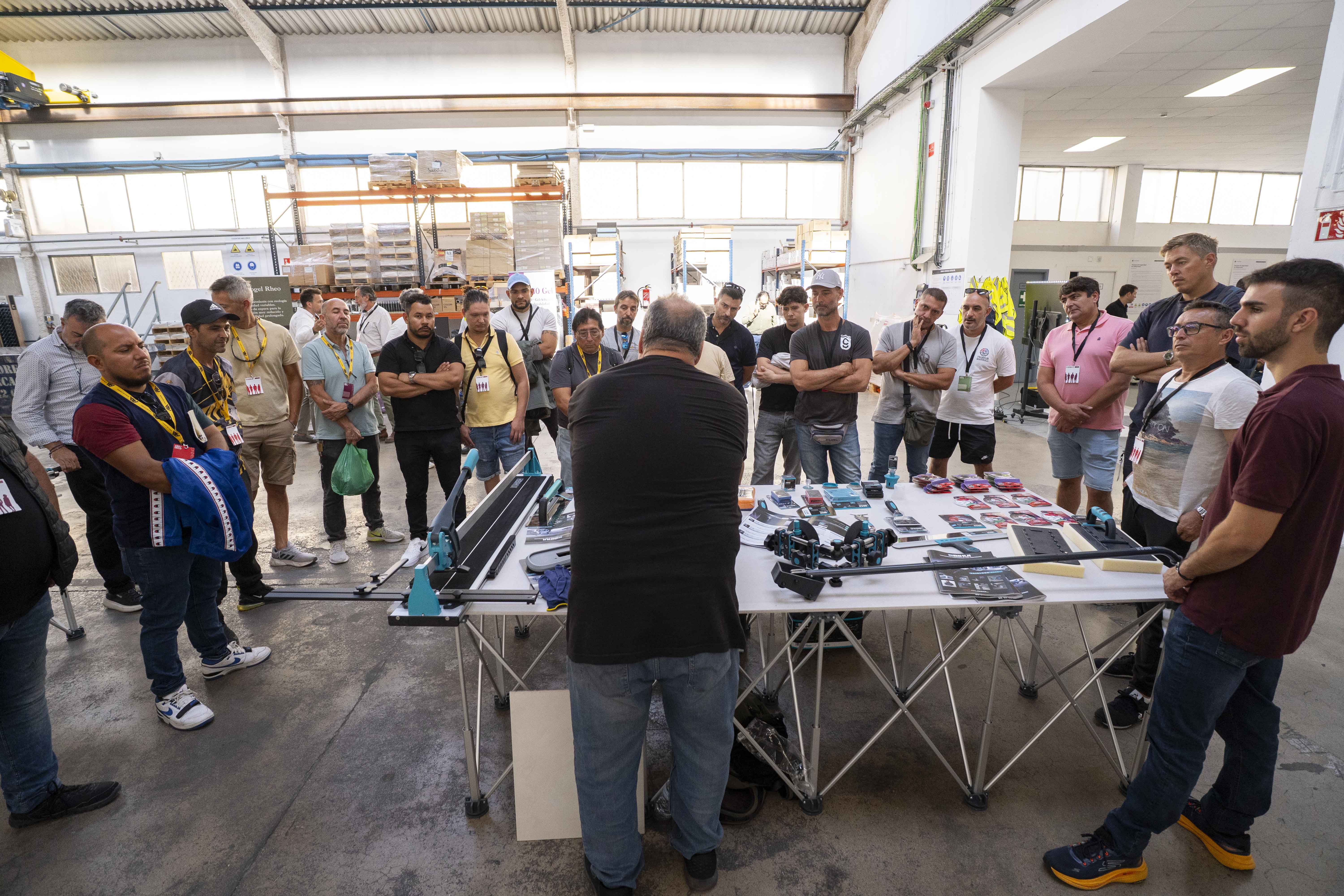
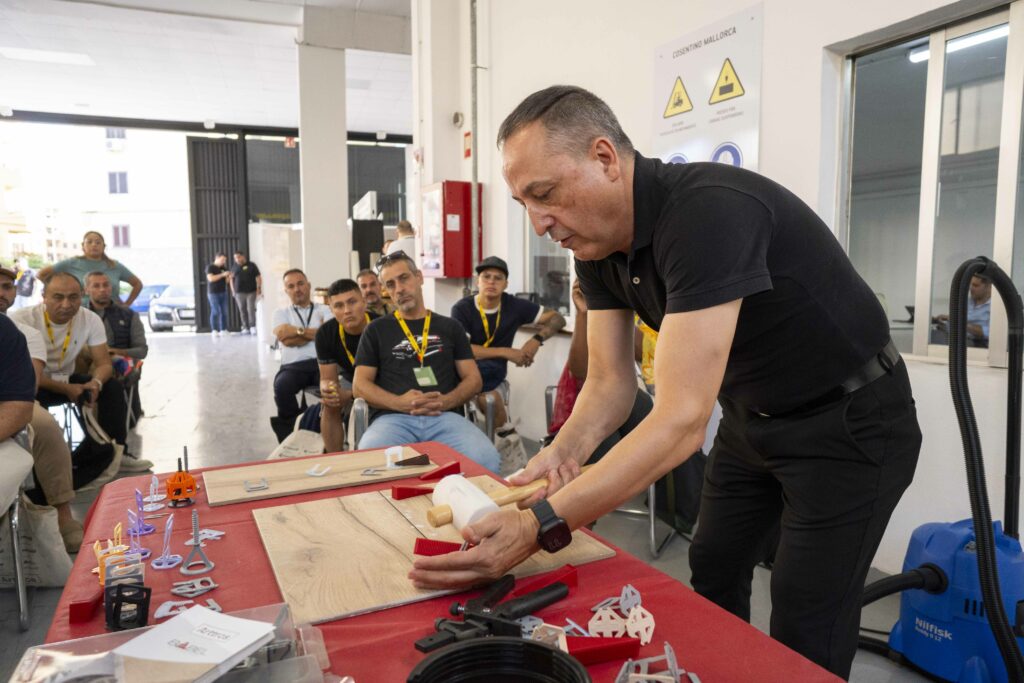
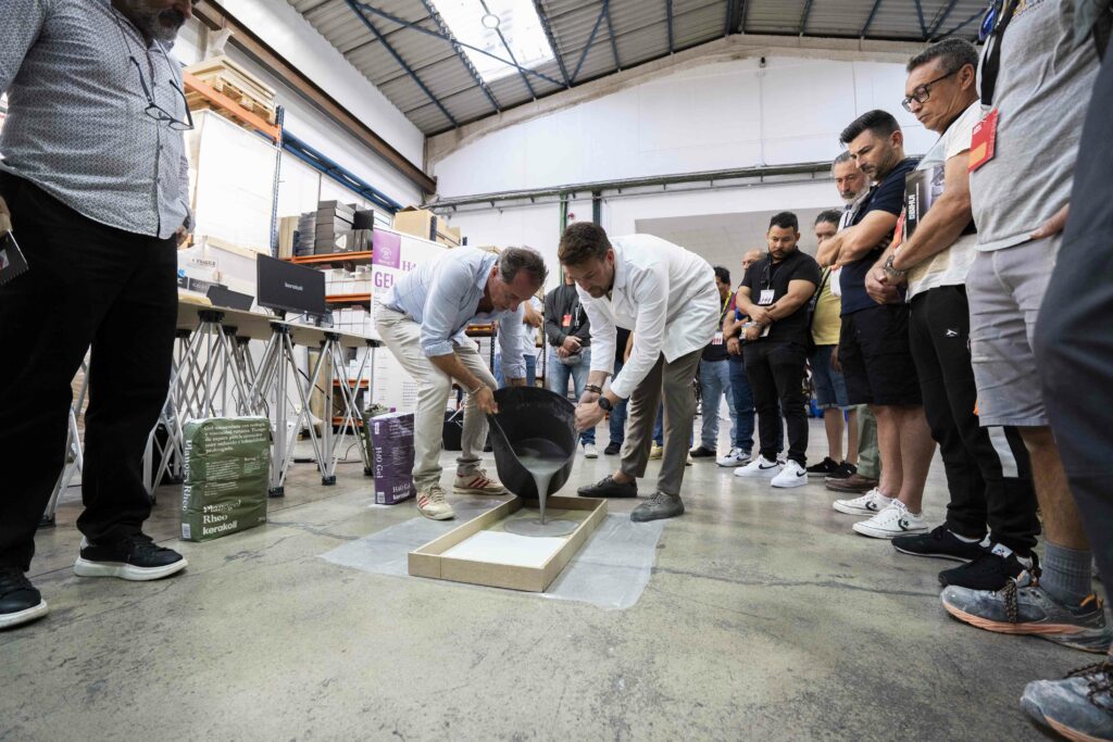
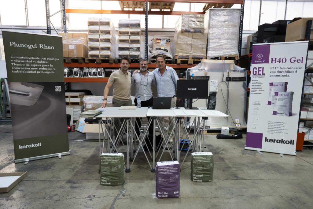
Los días 22 y 23 de octubre, Kerakoll participó activamente en las jornadas organizadas por Tu Reforma en Mallorca, reforzando su compromiso con la formación y la sostenibilidad en la construcción. La firma estuvo presente en el Networking Activo celebrado en la Fundación AEDIFICAT y en la Masterclass XXL realizada en Cosentino Center Mallorca, dos encuentros que reunieron a profesionales de la arquitectura, la reforma y la instalación.
Durante el Networking Activo, Kerakoll ofreció una ponencia centrada en la reparación y refuerzo estructural en edificaciones históricas y tradicionales, abordando la importancia de utilizar materiales compatibles y respetuosos con la estructura original. Los asistentes conocieron las soluciones a base de morteros de cal hidráulica natural NHL y los sistemas minerales de consolidación y refuerzo, ideales para intervenciones en patrimonio construido.
En la Masterclass XXL del día siguiente, la marca cambió el foco hacia la práctica profesional, presentando su tecnología de cementos-gel y autonivelantes. Los técnicos de Kerakoll explicaron las ventajas de estos productos en la preparación de soportes y la colocación de cerámica de gran formato, destacando su capacidad para ofrecer planimetría perfecta, trabajabilidad óptima y sostenibilidad en obra.
Con su doble participación en Mallorca, Kerakoll reafirma su papel como aliado técnico de los profesionales, combinando innovación, rendimiento y respeto medioambiental en cada una de sus soluciones constructivas.
![]()


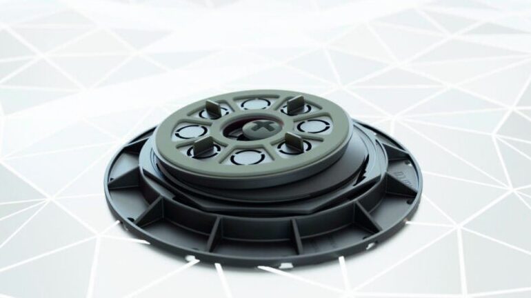
CLIMAVER® (RE)cuperar para (RE)ciclar proporciona una trazabilidad total del residuo a lo largo de todo el proceso, poniendo en relieve el compromiso de Isover con la sostenibilidad.
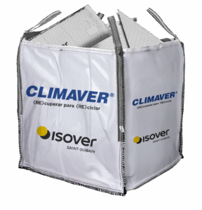 Saint-Gobain Isover, líder mundial en soluciones de aislamiento para edificación y climatización, presenta CLIMAVER® (RE)cuperar para (RE)ciclar, su nuevo servicio de reciclaje para recortes CLIMAVER® 360.
Esta iniciativa pionera, integrada dentro del servicio de circularidad Isover Recicla, ofrece a los profesionales instaladores de soluciones CLIMAVER® la recogida y gestión de los recortes CLIMAVER® 360 generados en obra. Posteriormente, estos recortes son reintroducidos en los procesos de producción de la fábrica de Isover para generar nuevas lanas minerales, reduciendo así el uso de materias primas y revalorizando el residuo.
Los conductos autoportantes de lana mineral CLIMAVER® 360 son la solución líder de Isover para climatización y ventilación, y aúnan las máximas prestaciones de eficiencia y sostenibilidad. La gama CLIMAVER® 360 incorpora revestimientos patentados que mejoran la eficiencia térmica y acústica de las instalaciones, alcanzando la máxima clasificación de estanqueidad ATC 1 según el RITE. Asimismo, las soluciones cuentan con estudio de su Análisis del Ciclo de Vida (ACV) y con Declaraciones Ambientales de Producto (DAPs) verificadas por un tercero, evaluando de esta forma su impacto ambiental durante toda su vida útil. 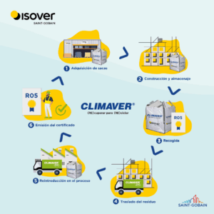
El servicio CLIMAVER® (RE)cuperar para (RE)ciclar proporciona una trazabilidad total del residuo a lo largo de todo el proceso, acelerando así el camino hacia la economía circular. Una vez el residuo ha sido gestionado y revalorizado, el instalador puede obtener su Certificado Oficial de Reciclado (R05). De esta forma, el instalador contribuye a impulsar la economía circular para lograr el cambio hacia una construcción más sostenible.
“La circularidad es un pilar clave en el modelo de construcción sostenible del Grupo Saint-Gobain. Por ello, Isover promueve la recogida de los recortes CLIMAVER® generados en el momento de su instalación en obra, con el objetivo de recuperarlos y reutilizarlos en nuestros procesos de producción en la fábrica de Azuqueca de Henares. Nuestro exclusivo método MTR ya nos permite una utilización del material superior al 99%, y ahora es el momento de seguir avanzando para hacer un mejor aprovechamiento y reutilización de los recortes CLIMAVER®”, comenta María Luisa Pérez, jefa de Soluciones Técnicas de Saint-Gobain.
El servicio CLIMAVER® (RE)CUPERAR PARA (RE)CICLAR responde al compromiso de Isover de construir mejor para las personas y el planeta, siempre guiado por el propósito común del Grupo Saint-Gobain “MAKING THE WORLD A BETTER HOME”.
Descubre toda la información sobre el nuevo servicio de reciclaje en: https://www.isover.es/climaver-recicla
Sobre Isover
Isover, como parte del Grupo Saint-Gobain, se compromete a construir mejor para las personas y el planeta, diseñando, fabricando y comercializando soluciones innovadoras de aislamiento térmico, acústico y protección frente al fuego para edificios y equipos, que proporcionan sostenibilidad con las más altas prestaciones.
Isover se ha posicionado como líder en el mercado de aislamientos y climatización (conducción de aire) entre otras razones, por poner a disposición de su red de distribución la gama más amplia de sistemas completos con la mejor combinación de confort térmico, acústico, eficiencia energética y seguridad. La compañía cuenta con instalaciones productivas en Azuqueca de Henares (Guadalajara) con dos líneas de producción de lana de roca y lana de vidrio en cinco mercados distintos: edificación, industria, marina, HVAC (soluciones para climatización y ventilación) y OEMs.
Líder mundial en construcción ligera y sostenible, Saint-Gobain diseña, fabrica y distribuye materiales y servicios para los mercados de la construcción y la industria. Sus soluciones, integradas para la renovación de edificios públicos y privados, la construcción ligera y la descarbonización de la construcción y la industria, se desarrollan a través de un proceso continuo de innovación, proporcionan sostenibilidad y grandes prestaciones. El Grupo, que celebra su 360 aniversario en 2025, está más comprometido que nunca con su propósito de “MAKING THE WORLD A BETTER HOME”.

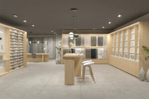
Esas piezas pequeñas, tan importantes, que muchas veces acaban apiladas en una estantería… Ahora pueden convertirse en el centro de atención. La nueva serie Boutique de INSCA revoluciona la forma de presentar el pequeño formato en ceramotecas, ayudando a los clientes a visualizar diseños, combinar materiales y dejarse llevar por la inspiración.
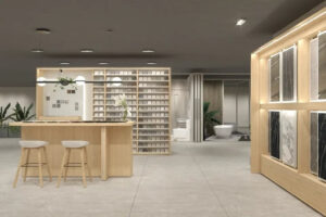
Boutique Workbench es mucho más que un expositor: su panel imantado permite crear composiciones en segundos, combinando muestras al instante. Una herramienta pensada para que clientes y comerciales puedan transformar ideas en moodboards reales, potenciando la inspiración y la toma de decisiones.
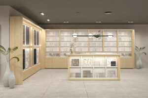
La serie Boutique destaca por su versatilidad y diseño modular. Combina estanterías, bancos de trabajo y soluciones de almacenaje para crear una composición a medida, optimizando el espacio y realzando la calidad visual de cada pieza expuesta. Un sistema pensado para adaptarse a las necesidades de cada showroom.
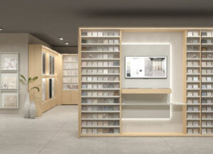
La innovación también llega de la mano del sistema I.RIS v03, ahora integrado en Boutique. Esta tecnología permite escanear una muestra (a partir de 30×30 cm) y mostrar al instante ambientes, combinaciones e información técnica en pantalla. Una experiencia digital, intuitiva y envolvente que inspira y convence con solo un clic.
Además, Boutique incorpora las mejores prácticas de exposición para pequeño formato, con soluciones que optimizan la organización y la visibilidad del producto. Desde la disposición de las piezas hasta la integración tecnológica, todo está pensado para impulsar las ventas y la experiencia del cliente.
INSCA: empresa especialista en soluciones expositivas con más de cuarenta años de experiencia construyendo relaciones duraderas con sus clientes. Lidera el diseño, desarrollo y fabricación de sistemas de exposición para cerámica y materiales de construcción, combinando diseño, innovación e ingeniería de valor. Cuenta con un equipo multidisciplinar de más de 150 profesionales —ingenieros, arquitectos, interioristas y carpinteros— que trabajan con una misma misión: transformar la madera y el metal en soluciones expositivas capaces de impulsar las ventas y potenciar la imagen de marca de sus clientes.

Al afrontar una reforma integral, elegir el sistema de climatización adecuado puede marcar la diferencia entre un hogar cómodo y eficiente o uno con altos consumos. En una ciudad como Madrid, donde los veranos abrasadores y los inviernos fríos exigen soluciones versátiles, la climatización no es un lujo, sino una necesidad. Un sistema bien elegido mejora el confort térmico, reduce el gasto energético y aumenta el valor de la vivienda, según la normativa del Código Técnico de la Edificación (CTE). Con opciones como el aire acondicionado, la aerotermia o el suelo radiante, tomar una decisión informada es clave. Esta guía práctica ofrece cinco claves para seleccionar el sistema ideal, optimizando el presupuesto y la eficiencia durante tu reforma.
El primer paso es evaluar las características del inmueble. El tamaño, la orientación y el aislamiento influyen directamente en la elección del sistema. Una vivienda nueva con buen aislamiento requiere menos potencia que una casa antigua con ventanas poco eficientes. Por ejemplo, un piso en Retiro, con mucha exposición solar, necesitará un equipo con mayor capacidad de refrigeración. Los locales comerciales, en cambio, suelen demandar sistemas robustos para espacios abiertos. Un estudio previo, realizado por un profesional, permite calcular la carga térmica exacta, evitando equipos sobredimensionados que elevan el consumo o insuficientes que no cumplen. Este análisis, respaldado por el CTE, asegura una solución adaptada al espacio.
La eficiencia energética es fundamental para reducir costes y minimizar el impacto ambiental. Sistemas con etiquetas A+++ y altos valores de COP/SCOP (coeficientes de rendimiento) garantizan un consumo mínimo. La aerotermia, por ejemplo, aprovecha la energía del aire para climatizar con un consumo mínimo, siendo una opción sostenible frente al aire acondicionado tradicional. Según el Reglamento de Instalaciones Térmicas en los Edificios (RITE), estos equipos deben cumplir estándares de eficiencia, lo que reduce las facturas hasta un 40%. En lugares especializados de aire acondicionado Sabadell como Climprecios, se pueden comparar soluciones eficientes que optimizan el rendimiento, desde bombas de calor hasta sistemas multisplit, ideales para reformas modernas.
La elección del sistema depende del uso y el presupuesto. El aire acondicionado por splits es económico y fácil de instalar, pero menos eficiente en espacios grandes. Los sistemas multisplit sirven para climatizar varias estancias, mientras que los conductos son ideales para reformas integrales, aunque requieren más inversión. La aerotermia, aunque costosa inicialmente, ofrece calefacción, refrigeración y agua caliente con un solo equipo. El suelo radiante, regulado por el RITE, proporciona confort uniforme, pero su instalación es compleja. Cada opción tiene pros (versatilidad, eficiencia) y contras (coste, instalación), por lo que evaluar el uso diario y las prioridades financieras es esencial.
Una reforma exitosa requiere planificar la climatización desde el inicio. Los conductos, rejillas y unidades interiores deben integrarse sin comprometer la estética ni encarecer la obra. Por ejemplo, los sistemas por conductos necesitan falsos techos, lo que debe diseñarse en la fase inicial para evitar improvisaciones. La normativa de urbanismo municipal exige que las unidades exteriores cumplan requisitos estéticos, especialmente en edificios protegidos. Una planificación adecuada, con planos técnicos, garantiza un acabado limpio y funcional, elevando el valor del inmueble.
El éxito de la climatización depende de profesionales cualificados y productos de calidad. Instaladores certificados, que cumplan con el RITE, aseguran un montaje eficiente y seguro. Antes de tomar una decisión definitiva, conviene comparar diferentes soluciones y precios en plataformas especializadas de instaladores aire acondicionado Sabadell, que ofrecen opciones fiables y adaptadas. Elegir marcas reconocidas garantiza durabilidad y acceso a repuestos, mientras que un instalador experto optimiza el rendimiento del equipo.
En este sentido, elegir el sistema de climatización adecuado en una reforma implica analizar el espacio, priorizar la eficiencia, seleccionar según el uso, integrar el diseño y confiar en profesionales. Con estas claves, tu hogar en Madrid será un espacio de confort sostenible.

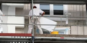
En la actualidad la eficiencia energética se ha convertido en una prioridad, por lo que la rehabilitación vertical de los tejados se presenta como una de las soluciones más rentables y sostenibles para mejorar el rendimiento térmico de los edificios. Este tipo de intervención permite actuar directamente sobre los puntos críticos de pérdida de calor y humedad sin necesidad de grandes obras ni estructuras auxiliares.
La rehabilitación de cubiertas mediante trabajos verticales combina rapidez, seguridad y precisión, factores que resultan esenciales en entornos urbanos o en edificios de difícil acceso. Además, reduce notablemente los costes asociados a los andamios y minimiza el impacto visual y acústico durante la ejecución de la obra, una ventaja importante para comunidades de propietarios o instalaciones activas.
A diferencia de las reformas convencionales, esta técnica se basa en sistemas de suspensión mediante cuerdas y anclajes homologados, que permiten acceder a cualquier zona del tejado con total seguridad. Gracias a ello, los especialistas pueden realizar desde tareas de reparación de tejas y canalones hasta la aplicación de aislamientos térmicos e impermeabilizaciones sin interrumpir la actividad interior del edificio.
El aislamiento de tejados con la técnica vertical es particularmente eficaz porque no requiere andamios y permite una intervención más rápida. Sin embargo, es fundamental que el trabajo lo realicen expertos en la técnica para evitar resultados deficientes en el ahorro energético y posibles daños en la estructura, y así reducir costes energéticos con la rehabilitación vertical de los tejados.
La correcta elección del material aislante es otro factor determinante. Los más habituales son los paneles de lana mineral, el corcho expandido o las espumas proyectadas de poliuretano, todos ellos diseñados para mejorar la eficiencia térmica y acústica del edificio. Además, su aplicación en la cubierta contribuye a mantener una temperatura interior más estable durante todo el año, reduciendo la dependencia de sistemas de climatización y, por tanto, el consumo energético.
La rehabilitación vertical no solo ofrece ventajas en términos de eficiencia, sino también de mantenimiento preventivo. Gracias a esta metodología, es posible detectar filtraciones, grietas o zonas deterioradas antes de que provoquen problemas estructurales más graves. De esta forma, se prolonga la vida útil del edificio y se optimizan los recursos destinados al mantenimiento.
En ciudades donde el espacio es limitado, los trabajos verticales permiten intervenir sin ocupar la vía pública ni generar molestias a los vecinos. Su versatilidad y bajo impacto logístico los convierten en una alternativa ideal frente a los sistemas convencionales de reforma.
Además, este tipo de actuaciones son compatibles con programas de rehabilitación energética subvencionados por administraciones públicas, lo que incrementa aún más su atractivo económico para propietarios y comunidades.
Apostar por la rehabilitación vertical de los tejados no solo supone una mejora estética o estructural, sino también una inversión inteligente a largo plazo. Aplicar un buen aislamiento térmico, reparar filtraciones y mantener la cubierta en buen estado puede suponer un gran ahorro energético y un mayor confort en el interior del edificio.
Gracias a las técnicas verticales, estos beneficios se logran de forma más rápida, segura y sostenible, reforzando la idea de que el futuro de la eficiencia energética pasa, también, por mirar hacia arriba.
")
La firma francesa Focus, reconocida internacionalmente por sus chimeneas de diseño suspendidas, amplía su colección de modelos a bioetanol con el lanzamiento del Filiofocus 1600, una versión que combina libertad, sostenibilidad y elegancia sin precedentes.
Inspirado en el icónico modelo Filiofocus, este nuevo diseño conserva su carácter escultórico y su forma esbelta, pero introduce una tecnología de combustión limpia y sin restricciones, que permite disfrutar de la magia del fuego incluso en espacios donde no es posible instalar una salida de humos.
El Filiofocus 1600 representa una evolución hacia una experiencia más versátil y respetuosa con el entorno. Gracias a su funcionamiento con bioetanol, ofrece una llama auténtica y espectacular, sin emisión de humo ni necesidad de instalación compleja. La libertad de ubicación permite integrar el modelo en proyectos de interiorismo contemporáneo, hoteles, restaurantes o viviendas donde el diseño y el confort conviven con la sostenibilidad.

Fiel a la filosofía Focus, el nuevo modelo mantiene la pureza estética, las proporciones equilibradas y la excelencia artesanal que caracterizan a la marca. Su estructura metálica, elaborada con precisión en los talleres de Focus en el sur de Francia, evidencia un cuidado minucioso por los detalles y una apuesta decidida por el diseño como lenguaje universal.
El sistema de quemado ha sido optimizado para ofrecer un efecto visual envolvente, con llamas que bailan en estado puro, generando una sensación de calidez y sofisticación. El resultado es una pieza escultórica que no solo calienta, sino que también transforma el espacio en una experiencia sensorial.
Con el Filiofocus 1600, Focus ofrece a arquitectos y diseñadores la posibilidad de elegir entre diferentes energías y configuraciones, adaptándose a las necesidades de cada proyecto. Ya sea con gas, leña o bioetanol, el diseño icónico se mantiene inalterable, reafirmando la versatilidad de la marca.
Junto al nuevo modelo, Focus presenta Kasybio, un accesorio funcional y estético diseñado para complementar las chimeneas a bioetanol. Su estilo sobrio y refinado se integra a la perfección en cualquier ambiente, ofreciendo una solución práctica y elegante para el almacenamiento y manejo del combustible.
Desde su fundación, Focus ha combinado arte, ingeniería y pasión por el fuego. Cada chimenea se fabrica en Francia con un nivel de excelencia artesanal que ha convertido a la marca en un referente mundial. Con el Filiofocus 1600, Focus reafirma su liderazgo en innovación y diseño sostenible, prolongando la saga bioetanol con una propuesta tan icónica como contemporánea.

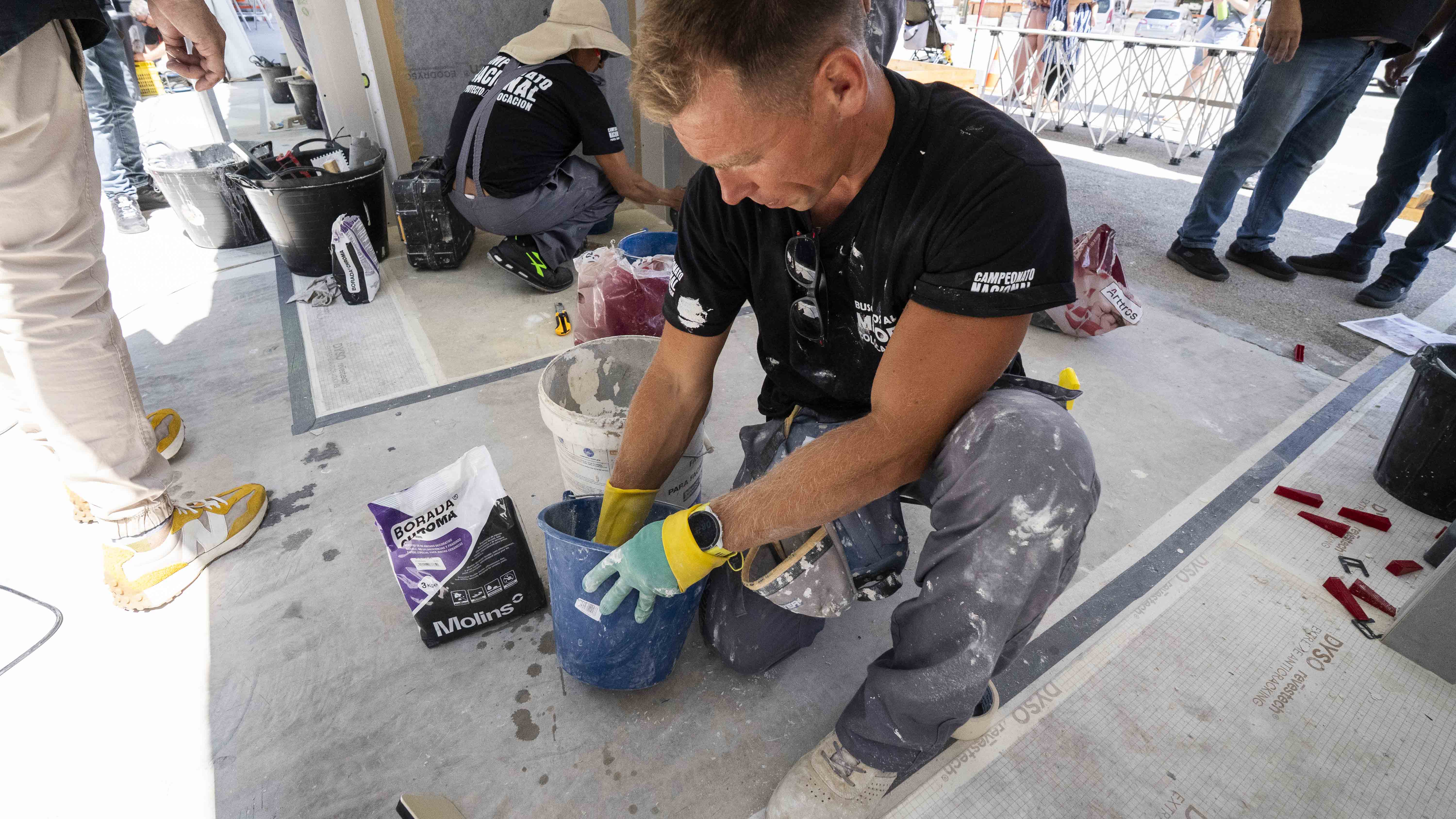
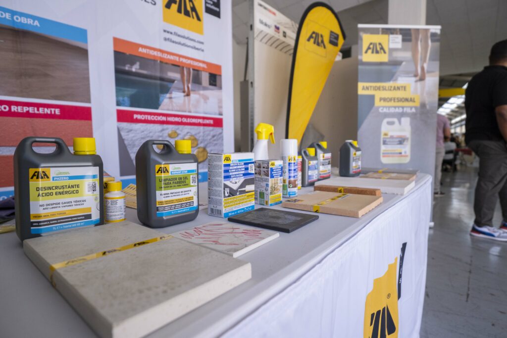
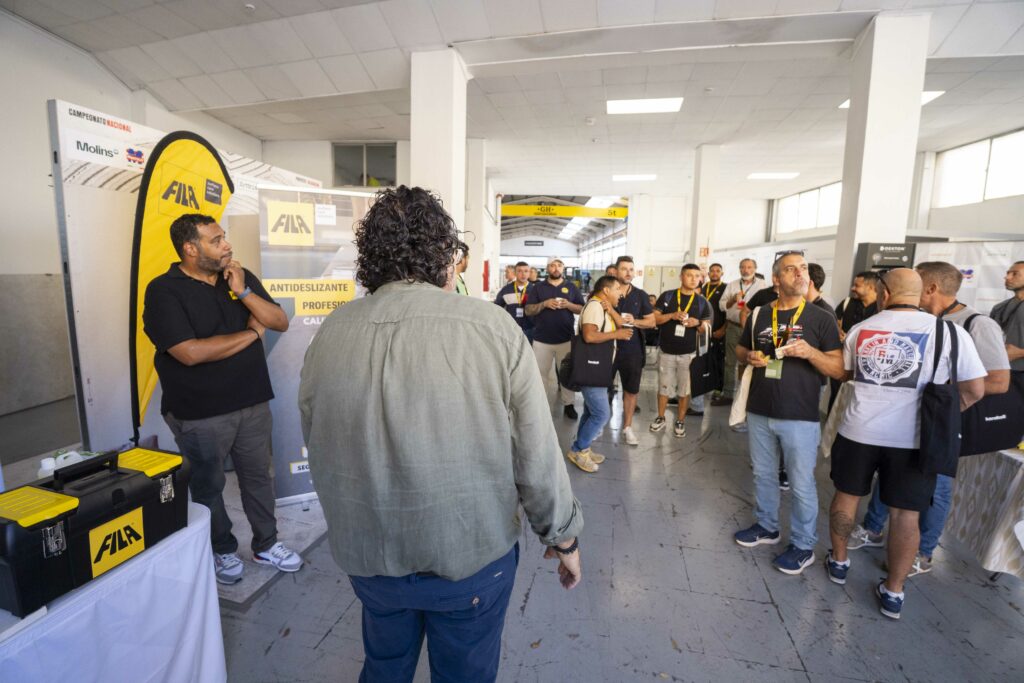
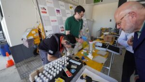
PROYECTO/COLOCACIÓN te invita al Campeonato Nacional de Colocadores, una emocionante iniciativa que celebra el talento, la técnica y la dedicación de los mejores instaladores de España.
Este evento, abierto al público, ofrece una oportunidad única para vivir de cerca una competición que pone en valor las habilidades clave del arte de la colocación. Su objetivo: impulsar la innovación, compartir experiencias y dar visibilidad a los verdaderos profesionales del sector.
Cada desafío ha sido cuidadosamente diseñado para evaluar tanto la precisión como la rapidez, exigiendo lo mejor de cada participante y premiando la excelencia técnica.
El campeonato llega a Gipuzkoa con su fase provincial, que se celebrará en las instalaciones de Jorge Fernández
🕛 7 de Noviembre inicio de las pruebas: 10:00 h
⌛ Duración: 5 horas de competición intensa
🏆 Al final del día, el jurado anunciará al mejor colocador de Gipuzkoa.
Los ganadores de esta fase recibirán productos de algunas de las marcas más reconocidas del sector.
Y eso no es todo:
👉 El gran campeón nacional obtendrá un premio en metálico, productos exclusivos de marcas líderes y el prestigioso título de Mejor Colocador de España, un reconocimiento que marcará un antes y un después en su carrera profesional.
El Campeonato de Colocadores no solo premia la destreza técnica; también pone en valor el papel esencial de los profesionales de la construcción.
Este certamen es reflejo del compromiso de PROYECTO/COLOCACIÓN con la calidad, la formación y la excelencia en el oficio.

Conoce las empresas que nos acompañan:

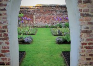
Entre 2009 y 2013, un ambicioso proyecto de restauración paisajística devolvió a La Garenne, una propiedad privada situada en la campiña belga de Petit-Roeulx, su antiguo esplendor. Enclavada en un entorno sereno con amplias vistas, esta finca de casi 7.000 metros cuadrados había permanecido sin mantenimiento durante años, hasta que un equipo especializado emprendió su recuperación integral.
El agua se erige como el hilo conductor del lugar: dos estanques, un canal y un río atraviesan la propiedad, recordando el papel esencial de este recurso en su historia, marcada por la presencia de un antiguo molino de agua. Cuando los nuevos propietarios asumieron el reto, el jardín mostraba signos de abandono y las estructuras se encontraban deterioradas. El objetivo fue claro: devolver la vida al paisaje, respetando su espíritu original.
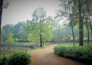

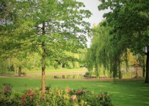

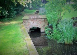

El proyecto contempló la restauración de muros, la limpieza de los estanques y canales, la redefinición de senderos y caminos, así como la renovación de bordes y plantaciones. También se crearon nuevos espacios —entre ellos un huerto contemporáneo, una isla para aves y unas riberas rediseñadas— que ampliaron las posibilidades de disfrute y observación de la naturaleza.
El resultado es un jardín que se transforma con las estaciones, ofreciendo una experiencia viva y cambiante. “Este proyecto ilustra la escenografía del jardín como una obra en movimiento, que se descubre con la luz y el paso del tiempo”, destaca uno de los responsables de la restauración.


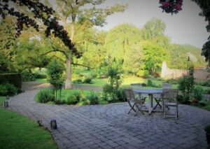
Más allá de la técnica, La Garenne fue también una aventura humana. La colaboración entre los propietarios, apasionados por el arte y la naturaleza, y el equipo de trabajo permitió materializar una visión común y duradera. Hoy, más de una década después de finalizadas las obras, La Garenne se mantiene como un espacio inspirador, ejemplo de cómo la restauración paisajística puede revivir el patrimonio natural y ofrecer al mismo tiempo un entorno auténtico y poético.


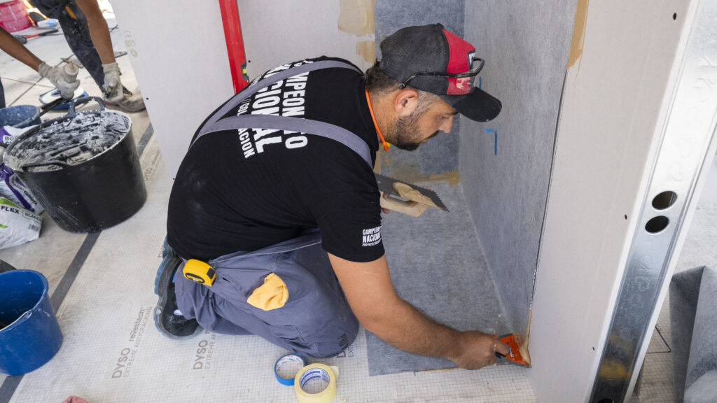
Prepárate para una jornada técnica imprescindible, dedicada a los procedimientos de instalación de materiales cerámicos XXL y superficies ultracompactas de última generación.
Jueves, 6 de noviembre de 2025
De 10:00 h a 14:00 h
Cosentino Center San Sebastián , Polig. Ind. Lanbarren, Arkotz Kalea, 8, Arragua, 20180 Oiartzun, Gipuzkoa
Esta masterclass está especialmente diseñada para:
Instaladores profesionales y colocadores de cerámica de gran formato
Reformistas y empresas de reforma integral
Técnicos de obra, aparejadores y jefes de ejecución
Especialistas en rehabilitación constructiva y eficiencia energética
Distribuidores y almacenes de materiales técnicos
La jornada tendrá como eje central el aprendizaje práctico en torno a los procesos de instalación de grandes formatos cerámicos, así como el conocimiento de las herramientas, adhesivos y técnicas más eficientes del mercado.
El evento contará además con una zona de stands técnicos en la que los patrocinadores y empresas colaboradoras ofrecerán asesoramiento personalizado, resolución de dudas y exhibiciones prácticas, en grupos reducidos y bajo supervisión experta.
Empresas colaboradoras:

![]()
![]()
![]()

El pasado 23 de octubre, las instalaciones de Cosentino Center Mallorca acogieron una nueva edición de la Masterclass XXL, una jornada formativa que reunió a instaladores, reformistas y profesionales de la construcción interesados en perfeccionar su técnica en la colocación de superficies cerámicas y ultracompactas de gran formato.
Durante la sesión, los asistentes participaron en talleres prácticos y demostraciones técnicas, centradas en los procesos de instalación avanzada, la preparación del soporte y el uso de herramientas especializadas para garantizar resultados precisos y de alta calidad.
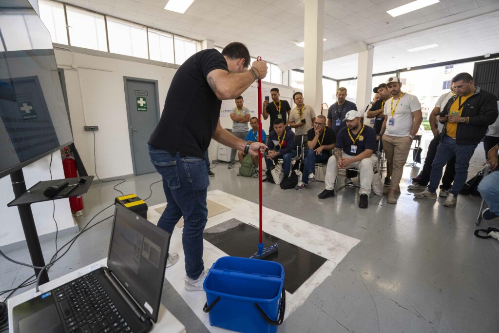
Las empresas colaboradoras desempeñaron un papel clave con presentaciones técnicas y demostraciones en directo:
La Masterclass XXL Mallorca se consolidó como un punto de encuentro clave para los profesionales que buscan mejorar sus competencias, descubrir nuevas soluciones técnicas y conectar con marcas líderes del sector.
La jornada se desarrolló en un entorno participativo, donde los asistentes pudieron intercambiar experiencias, resolver dudas y establecer nuevos vínculos profesionales con técnicos y fabricantes.


Nuestros encuentros de Networking se visten de gala con la presencia del conocido arquitecto Jaime Sanahuja, Doctor en Arquitectura y profesor de proyectos en la Escuela Superior de Arquitectura de la Universidad Politécnica de Valencia, nos ofrecerá una visión única sobre su enfoque arquitectónico, titulado Arquitectura desde el Mediterráneo.
Poligono Industrial Lanbarren, Arkotz Kalea 8, Arragua, 20180, Gipuzkoa
Con la colaboración del Colegio Oficial de Diseñadores de Interiores / Decoradores de Guipuzcoa

Además, durante el NETWORKING Activo, podrás participar en sesiones exprés impartidas por nuestro equipo de profesionales, donde se abordarán diversas temáticas relacionadas con la arquitectura sostenible y la innovación en el sector.
Este evento es la ocasión perfecta para profesionales y empresas comprometidos con la construcción sostenible. Será un espacio único para intercambiar ideas, establecer colaboraciones y aprender de las mejores prácticas del sector, todo mientras disfrutas de una experiencia incomparable de networking.
![]()
![]()

![]()

eventos@tureforma.org
+34 964 246 950
+34 722 207 518

Tecnología eficiente para un aire más saludable: Daitsu optimiza el control de la humedad con la gama Aral.
Con la llegada del otoño, las lluvias y el aumento de la humedad ambiental, Eurofred, multinacional especializada en soluciones de confort térmico y calidad del aire, lanza la nueva gama de deshumidificadores Aral de Daitsu. Una propuesta pensada para hogares y pequeños espacios comerciales que combina eficiencia energética, bienestar y tecnología avanzada.
Con esta nueva línea, Daitsu refuerza su compromiso con la salud y el confort de las personas, ofreciendo equipos capaces de mantener un ambiente más seco, silencioso y saludable, adaptado a las necesidades reales de cada usuario, sobre todo aquellos sufren de alergias, asma o problemas respiratorios.
Máxima capacidad de deshumidificación en hogares y comercios
Los deshumidificadores Aral de Daitsu destacan por su capacidad para mantener la humedad ambiental estable incluso en condiciones adversas, evitando la condensación y creando un entorno más confortable y saludable. Su rendimiento continuo los convierte en un aliado esencial durante las temporadas de lluvia o en viviendas con alta humedad.
El modelo ADD-20XB incorpora además el innovador Modo Lavandería, diseñado para acelerar el secado de la ropa en interiores, aportando un valor añadido en el día a día de los hogares.
Altas prestaciones para un control total
Los deshumidificadores Aral ofrecen un rendimiento fiable, eficiente y sencillo de usar. Entre sus principales características destacan:
Diseño funcional y rendimiento eficiente para espacios sostenibles
La gama Aral combina prestaciones avanzadas con un diseño compacto y ligero que facilita su transporte y almacenamiento. Cada unidad incluye ruedas y un asa superior, lo que facilita su transporte entre estancias, mientras que su cubeta de gran capacidad permite un uso prolongado antes de necesitar vaciado. La opción de drenaje continuo refuerza aún más la comodidad y el mantenimiento sencillo del equipo.
Los nuevos deshumidificadores Aral de Daitsu están diseñados bajo los más altos estándares de eficiencia energética, garantizando un funcionamiento respetuoso con el medio ambiente. Incorporan el refrigerante natural R290, que combina un bajo impacto ambiental con un rendimiento óptimo, cumpliendo con la normativa ERP vigente.
Gracias a estos avances, la gama Aral ofrece una solución duradera, responsable y eficiente tanto para uso doméstico como profesional, reafirmando el compromiso de Daitsu y Eurofred con un confort más sostenible.
Sobre Eurofred:
Eurofred es una multinacional con sede en España, Portugal, Italia y Chile. Distribuye en exclusiva marcas como Fujitsu, General y su propia marca Daitsu, entre otras. Equipamientos para diferentes sectores (climatización doméstica, comercial e industrial) que destacan por su alta eficiencia energética en un modelo que contempla el canal profesional y el consumidor final, a los que ofrece la máxima excelencia en productos y servicios.

La nueva campaña de invierno de Junkers Bosch premiará la confianza de los instaladores con regalos exclusivos por la compra de calderas murales de condensación.
Con la llegada del frío y las fiestas navideñas a la vuelta de la esquina, Bosch pone en marcha una nueva campaña dirigida a los instaladores profesionales para agradecer su confianza y compromiso con la marca. Bajo el lema “Esta Navidad cárgate de regalos con las calderas Bosch”, la promoción estará activa del 1 al 30 de noviembre de 2025 e incluirá una amplia selección de obsequios y recargas en el programa de fidelización Junkers Bosch plus, que se adaptan al número de calderas adquiridas por los profesionales durante el período promocional.
La iniciativa, exclusiva para el canal profesional, está dirigida a quienes instalen calderas murales de condensación de la gama Bosch Condens —Condens 1200 W, 4300i W, 4700i W, 5300i WT, 6000 W y 8700i W—, equipos reconocidos por su diseño compacto, su elevada eficiencia y su conectividad inteligente, capaces de ofrecer un confort óptimo con el máximo rendimiento energético, aportando ahorro y confort y en el hogar.
Por cada instalación realizada, los profesionales podrán obtener desde recargas en la tarjeta Junkers Bosch plus hasta premios directos como cestas de Navidad, productos gourmet, vinotecas, paletas y jamones de bellota, hoverboards o escapadas premium, entre otros regalos exclusivos.
Con esta acción, Junkers Bosch refuerza su compromiso con los profesionales del sector, apoyando su labor diaria y reconociendo su papel clave en la instalación de soluciones más tecnológias, eficientes y sostenibles.
La promoción es válida hasta el 30 de noviembre de 2025 o hasta fin de existencias, y los formularios serán válidos hasta el 31 de diciembre de 2025.
Para más información las bases se encuentran en la página web www.bosch-homecomfort.es o accediendo al apartado de promociones del Club Junkers Bosch plus.
Grupo Bosch
El Grupo Bosch es un proveedor líder mundial de tecnología y servicios. Emplea aproximadamente a 417.900 empleados en todo el mundo (a 31 de diciembre de 2024). La empresa generó, en 2023, unas ventas de 90.500 millones de euros. Sus operaciones se agrupan en cuatro áreas empresariales: Mobility, Industrial Technology, Consumer Goods, y Energy and Building Technology. Con sus actividades empresariales, la empresa pretende utilizar la tecnología para ayudar a dar forma a tendencias universales como la automatización, la electrificación, la digitalización, la conectividad y la orientación hacia la sostenibilidad. En este contexto, la amplia presencia de Bosch en diferentes sectores y regiones refuerza su capacidad innovadora y su solidez. Utiliza su experiencia en tecnología de sensores, software y servicios, así como su propia nube IoT, para ofrecer a sus clientes soluciones conectadas transversales a través de una sola fuente. También aplica su experiencia en conectividad e inteligencia artificial para desarrollar y fabricar productos sostenibles y fáciles de usar. Con tecnología que es «Innovación para tu vida», Bosch quiere ayudar a mejorar la calidad de vida y a conservar los recursos naturales. El Grupo Bosch está formado por Robert Bosch GmbH y sus aproximadamente 470 filiales y empresas regionales en más de 60 países. Incluyendo los socios comerciales y de servicios, la red mundial de fabricación, ingeniería y ventas de Bosch cubre casi todos los países del mundo. La base para el desarrollo futuro de la compañía es su fuerza innovadora. Bosch emplea en todo el mundo a unas 86.900 personas en investigación y desarrollo, repartidas en 136 emplazamientos, de las cuales aproximadamente 48.000 son ingenieros de software.
La empresa fue fundada en Stuttgart en 1886 por Robert Bosch (1861-1942) como «Taller de mecánica de precisión e ingeniería eléctrica». La especial estructura de propiedad de Robert Bosch GmbH garantiza la libertad empresarial del Grupo Bosch. De este modo, la empresa puede planificar a largo plazo y realizar importantes inversiones para asegurar su futuro. El 94% del capital social de Robert Bosch GmbH pertenece a la fundación Robert Bosch Stiftung GmbH. Las acciones restantes están en manos de Robert Bosch GmbH y de una sociedad anónima de la familia Bosch. La mayoría de los derechos de voto están en manos de Robert Bosch Industrietreuhand KG, un trust industrial. Las funciones de propiedad empresarial son desempeñadas por el holding.

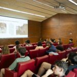
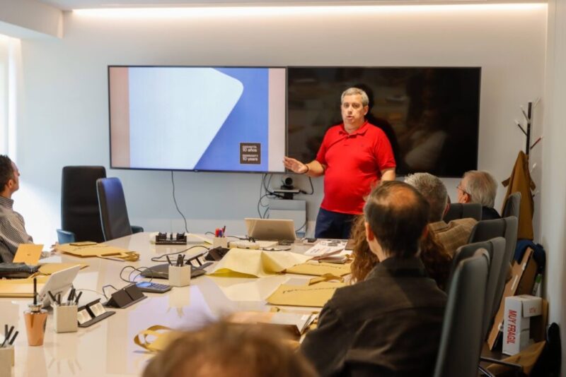
El Grupo ha organizado el encuentro “Soluciones sostenibles para tiempos de cambio”, en el que se ha compartido una visión sobre la aplicación de los criterios europeos de sostenibilidad con el objetivo de enriquecer el diálogo y acompañar al sector en este nuevo escenario.
Saint-Gobain, líder mundial en construcción ligera y sostenible, ha reunido a las principales voces del sector para valorar soluciones viables a los retos actuales. Lo ha hecho a través de la jornada “Soluciones sostenibles para tiempos de cambio” con el propósito de acelerar la transición sostenible del entorno construido, así como aportar una guía práctica para aplicar los criterios europeos de sostenibilidad en decisiones corporativas que mejoren el retorno, la gestión del riesgo y el desempeño ambiental y social del sector.
El encuentro ha contado con la participación de Silvia Llanes, directora de ESG y presidenta del Comité ESG de Gmp; Adrián Roiz, Arup Spain Technical Specialist Services team leader; Miguel Hernández, Strategy & Corporate Development director en Crea Madrid Nuevo Norte; Carolina Roca, presidenta de ASPRIMA; y Justo Orgaz, presidente del Green Building Council España (GBCe).
Esther Soriano, directora general de SaintGobain Solutions, ha dado la bienvenida a los asistentes expresando que: “En un momento de grandes retos y oportunidades, la sostenibilidad es una de las palancas clave para transformar el sector de la construcción. Y en Saint-Gobain creemos en las alianzas y los espacios de colaboración como motor para avanzar juntos hacia un sector más sostenible”. Además, ha subrayado que este encuentro ha sido el primero en España en incorporar el nuevo plan estratégico del grupo Saint-Gobain, Lead & Grow.
La sostenibilidad es palanca de competitividad e impacto positivo
En su intervención, Silvia Llanes, directora de ESG y presidenta del Comité ESG de Gmp, ha defendido que la sostenibilidad debe integrarse en el negocio como una auténtica palanca de competitividad, rentabilidad, impacto positivo y liderazgo. Ha subrayado que “no puede entenderse solo como una obligación regulatoria ni limitarse a un departamento, sino que requiere un enfoque estratégico transversal, impulsado por la alta dirección y sustentado en una cultura y un propósito corporativo genuino”. En este sentido, ha destacado la importancia de “un análisis de materialidad riguroso que permita diseñar un Plan ESG alineado con la identidad, los retos y las oportunidades de cada organización, así como con las expectativas de sus grupos de interés”.
Como principales motores de la transformación sostenible ha puesto el foco en la innovación “no solo tecnológica, sino también en procesos, servicios y estructuras organizativas”, y en la colaboración, tanto sectorial como público-privada, extendida a toda la cadena de valor: “Sin colaboración no hay nada. La sostenibilidad es un reto colectivo que solo puede abordarse desde la cooperación y la visión compartida”, ha concluido.
El Pacto Verde Europeo, la Taxonomía y el RPC redefinen la toma de decisiones
El panel de expertos, moderado por Adrián Roiz, director de ARUP España, ha destacado que el Pacto Verde Europeo, la Taxonomía y el Reglamento de Productos de la Construcción (RPC) ya están redefiniendo la toma de decisiones. Las organizaciones priorizan el alineamiento regulatorio (gobernanza, reporting y trazabilidad de materiales) para minimizar el riesgo, asegurar el cumplimiento y acceder a financiación verde. Además, ha subrayado la necesidad de datos comparables y métricas verificables que conecten la regulación con la viabilidad económica de los proyectos.
Asimismo, los ponentes han abordado las principales palancas para escalar la ejecución: el total design como vía para mejorar la bancabilidad y la calidad técnica desde fases tempranas; el equilibrio CAPEX–OPEX para capturar beneficios en eficiencia, resiliencia y valor del activo; la evolución de los criterios ESG de lo reputacional a la creación de valor y la gestión del riesgo; y la circularidad como estándar emergente, impulsando pasaportes de materiales, estandarización y colaboración público-privada. Con visión a 2030, han coincidido en que el reto es hacer de la sostenibilidad la norma, superando la fragmentación de criterios y la brecha de capacidades.
Miguel Hernández, director de Strategy & Corporate Development en Crea Madrid Nuevo Norte, ha abogado por la aplicación práctica: «No queremos ser un laboratorio. Con la sostenibilidad interiorizada, nos pegamos a las administraciones para equilibrar ambición y factibilidad. Empezamos por lo urgente (urbanización) mirando a lo que viene (edificación). La sostenibilidad es irreversible: es el modelo europeo».
Esther Soriano ha remarcado que la sostenibilidad es tanto una exigencia (social, económica, normativa) como una determinación: “La convicción es necesaria, para liderar y transformar el sector. En Saint-Gobain implementaremos año un horno eléctrico para fabricación de lana de roca en Azuqueca de Henares (Guadalajara), un impulso en el que creemos para abordar los retos de descarbonización. Trabajamos en soluciones para el presente y el futuro». Ha señalado además retos concretos en circularidad: «La circularidad, entendida desde la recogida, reintroducción y valorización; requiere inversión y colaboración en toda la cadena de valor, y entre los distintos agentes. Lo mismo ocurre con la descarbonización”.
Carolina Roca, presidenta de ASPRIMA, ha puesto el foco en la vivienda como principal reto de sostenibilidad en el sector inmobiliario: «Nos hemos centrado en la E, pero debemos atender la S. Incrementar criterios ESG encarece el proceso productivo y eleva el precio, reduciendo la accesibilidad, especialmente cuando los salarios medios no acompañan. El regulador empieza a entender que no se puede ir a golpe de directiva generalista y que la colaboración público-privada es clave».
Por último, Justo Orgaz, presidente de Green Building Council España, ha pedido liderazgo orientado a impacto: «No se trata de anticipar normas, sino impactos. El siguiente gran frente es la economía circular. En GBCe impulsamos una hoja de ruta para la circularidad, análoga a la de descarbonización. Formación y participación en foros que reflejen la realidad del mercado son esenciales».
El diálogo ha identificado obstáculos compartidos: el coste y la accesibilidad a la vivienda al incorporar criterios ESG, la circularidad como desafío económico y logístico que exige ecosistemas colaborativos, y la necesidad de flexibilidad regulatoria que reconozca realidades locales y potencie la colaboración público-privada.
Jean Luc Gardaz, CEO de Saint Gobain España, Portugal, Marruecos, Argelia y África Subsahariana ha cerrado el foro destacando que el sector ha superado la sostenibilidad como mero concepto: «Cuatro pilares deben guiar cualquier estrategia: normas, propósito, cultura y resultados. En Saint-Gobain, somos conscientes de que la construcción representa cerca del 40 % de las emisiones de CO₂ y otro 40 % del uso de recursos naturales. Nuestra respuesta pasa por convertir ese impacto en valor tangible para el usuario». Gardaz ha apelado a la corresponsabilidad: «Bajo el marco de nuestro nuevo programa estratégico Lead & Grow, asumimos la responsabilidad de demostrar ese valor y posicionarlo ante todos los actores de la cadena. Es una misión que requiere humildad y colaboración, porque no se puede cumplir en solitario».
Sobre Saint-Gobain
Líder mundial en construcción ligera y sostenible, Saint-Gobain diseña, fabrica y distribuye materiales y servicios para los mercados de la construcción y la industria.
Sus soluciones completas orientadas a la renovación de edificios, la construcción ligera y la descarbonización de la industria se desarrollan a través de un proceso continuo de innovación, proporcionando sostenibilidad y altas prestaciones. El Grupo, que celebra este año su 360 aniversario en el mundo y 120 años de presencia en España, impulsa ahora su nuevo plan estratégico global: “Lead & Grow”, con el que busca fomentar un crecimiento rentable a largo plazo y reforzar su papel clave en la transformación del sector de la construcción.
Compañía Saint-Gobain a grandes cifras:
")
Formación especializada en técnicas de colocación XXL, organizada por Proyecto Colocación
Tenerife se convertirá en el centro de la formación cerámica con un curso técnico diseñado para llevar tus habilidades al siguiente nivel.
Este programa cubre todas las fases del proceso de instalación de cerámica de gran formato:
Preparación adecuada de superficies
Selección y aplicación de adhesivos especializados
Uso de herramientas avanzadas para corte y nivelación
Técnicas para lograr acabados de alta precisión
La formación se impartirá en grupos reducidos, lo que garantiza una experiencia personalizada y orientada a resolver dudas concretas, perfeccionar habilidades y mejorar tu técnica de forma efectiva.
COSENTINO CENTER TENERIFE
Polígono de Valle de Güimar Parcela 11 B Manzana I,
38550 Arafo, Santa Cruz de Tenerife
Accede a los conocimientos más actualizados y aplicables del sector
Mejora inmediata en tus métodos de trabajo
Acceso directo a la bolsa de trabajo de las empresas formadoras
Conecta con otros profesionales y amplía tu red de contactos
Además, tendrás la oportunidad de formarte con el líder en impermeabilización del sector, aprendiendo sistemas constructivos innovadores para proteger y optimizar superficies como:
Terrazas
Cubiertas
Balcones
Zonas húmedas y duchas
Conviértete en especialista certificado en impermeabilización y accede a nuevas oportunidades profesionales dentro de su red de expertos.
🎟️ Reserva tu plaza hoy mismo y prepárate para transformar tu forma de trabajar.
")
Este nuevo Hotel de 4 estrellas se erige como un edificio emblemático en la ciudad de Barcelona, cerca del Aeropuerto El Prat.
Las soluciones de Saint-Gobain, líder mundial en construcción ligera y sostenible, han sido elegidas para la construcción del nuevo Hotel Bitàgora Four Points by Sheraton en Viladecans, Barcelona, con el fin de ofrecer el máximo nivel de confort a sus ocupantes.
Este hotel, diseñado por el estudio BCQ Arquitectura Barcelona y construido en 2024, se erige como un edificio emblemático y nuevo polo de atracción de la ciudad catalana. Conectado con el Parque de la Marina y con el parque Viladecans Business Park, este hotel de categoría 4* cuenta con 12 plantas y 204 habitaciones. La propuesta se integra en el entorno construido de la zona gracias a su volumetría simple y clara en consonancia con las demás edificaciones que la rodean. Además, las instalaciones ubicadas en la planta baja se integran en el conjunto como un zócalo unificador del proyecto.
En concreto, la superficie del edificio consta de un total de 13.788 m² y una intervención de espacio público de 3.147 m², por lo que el proyecto no solo contempla la construcción del hotel, también aprovecha y transforma un área exterior relevante.
La ejecución se ha realizado instalando más de 26.000 m2 de soluciones constructivas Saint Gobain, tanto en el diseño de su envolvente como en la ejecución de sus interiores, con el objetivo de promover un espacio saludable, seguro y confortable.
SOLUCIONES EFICIENTES SAINT-GOBAIN
El edificio se presenta como un volumen claro con una envolvente base oscura y continua con superposición de conjuntos de lamas de protección solar. Para garantizar una envolvente energéticamente eficiente, se han empleado 5.300 m² del SATE webertherm etics de Saint Gobain Weber, un sistema de fachada que proporciona un excelente aislamiento térmico y alta resistencia superficial al impacto. De esta forma, el hotel ha mejorado su aislamiento térmico, minimizando sus pérdidas energéticas.
Uno de los objetivos del Hotel Bitàgora era ofrecer un excelente confort a los huéspedes, con el fin de garantizar una temperatura adecuada en su interior y maximizar la entrada de luz natural. Por ello, se han empleado 1.500 m² del doble acristalamiento en ventanas conformado por los vidrios COOL-LITE® SKN 165 y PLANISTAR® ONE, ambos de Saint-Gobain Glass. La solución COOL-LITE® SKN 165 permite una elevada entrada de luz natural manteniendo un buen nivel de control solar y baja emisividad, contribuyendo así a reforzar el aislamiento térmico del hotel. Por otro lado, la solución PLANISTAR® ONE es un vidrio de capa de baja emisividad con alta selectividad, que también proporcionar un elevado aislamiento térmico para disminuir las pérdidas energéticas tanto en climas fríos como cálidos. La combinación de ambos vidrios ha permitido minimizar las necesidades de calefacción y refrigeración del hotel, haciéndolo más sostenible.
Otro de los puntos clave en la construcción de este hotel era la climatización. Gracias a la instalación de 3.500 m² de CLIMAVER® 360 Neto de Isover, las instalaciones del hotel cuentan con un adecuado aislamiento térmico y acústico. Esta solución es un conducto autoportante de lana mineral que cuenta con la mejor clasificación de estanqueidad del aire ATC 1, reduciendo hasta en un 97% las fugas de aire según RITE permitidas en las instalaciones. Su cara exterior cuenta con un revestimiento de aluminio reforzado con papel Kraft que actúa como barrera de vapor, mientras que en su cara interior cuenta con un tejido de vidrio reforzado que aporta una gran resistencia mecánica.
Los interiores del hotel han sido ejecutados con soluciones de Saint-Gobain Placo, en concreto, con 6.500 m2 en tabiquería, 6.000 m2 en trasdosados y 4.000 m2 en techos. Las soluciones empleadas han sido las placas de yeso laminado Placo® PPM, que ofrece una gran resistencia a la humedad, y Placo® PPF, solución especialmente diseñada para mejorar la protección pasiva del edificio, proporcionándole al hotel una mayor seguridad frente al fuego.
Las soluciones de Saint-Gobain Glass, Isover, Placo® y Weber instaladas en este proyecto responden al compromiso de las marcas de construir mejor para las personas y el planeta, siempre guiado por el propósito común del Grupo Saint-Gobain “MAKING THE WORLD A BETTER HOME”.
Sobre Saint-Gobain
Líder mundial en construcción ligera y sostenible, Saint-Gobain diseña, fabrica y distribuye materiales y servicios para los mercados de la construcción y la industria. Sus soluciones, integradas para la renovación de edificios públicos y privados, la construcción ligera y la descarbonización de la construcción y la industria, se desarrollan a través de un proceso continuo de innovación, proporcionan sostenibilidad y grandes prestaciones. El Grupo, que celebra su 360 aniversario en 2025, está más comprometido que nunca con su propósito de “MAKING THE WORLD A BETTER HOME”.
En el sector de la edificación, nos comprometemos a construir mejor para las personas y el planeta, a través de las marcas Saint-Gobain Glass, Isover, Placo® y Weber, ofreciendo la más amplia gama de sistemas innovadores que proporcionan confort, eficiencia energética, rendimiento y seguridad para impulsar la transformación del mercado de la construcción.